Pages

29 October 2011

It's Yummy Fresh...

From www.yummyfreshgrainfeed.com
It's definately Yummy and Fresh, but the question is, do you know about it? Or, maybe the question is, do you remember to consume it's delicious flavors regularly?

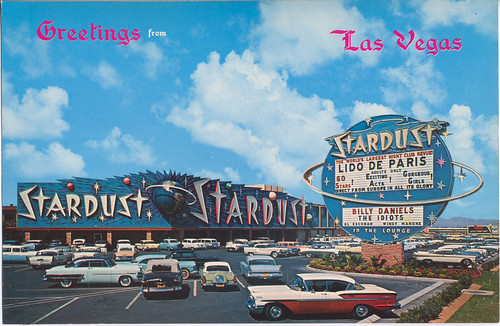
Ok, so I'm not talking about regular food. What am I talking about then? The food of illustrators, artists, and their enthusiasts. I'm talking about probably one of the most comprehensive Illustration blogs on the planet, and they just so happen to focus on a lot of designer that have a Mid-Century style. I'm talking about Grain Edit, or Yummy Fresh Grain Feed as it's called in the RSS feed.

If you don't know about this blog, you should really check it out. Grain Edit is a very professional blog that has showed over time that they have the contacts, and even more importantly, the knowledge that it takes to keep providing us with what we want to see.

As a designer myself, I'm constantly looking for that inspiration that is more than eye candy. I look for those illustrators and artists that make me think twice about their work, the detail, and the difficulty or simplicity that compel me to think. Grain Edit does this, and they do it very well.

Along with showing latest finds or the newest works from known artist, they also seek out the new up and coming illustrators.  Interviews with many of the artists featured on their site plays a big part in their influence on the illustration/design world as well. This gives a unique look into the artist motivations, and views that drive their individual style by each artists view of the world.

To be sure, Grain Edit is not lacking in expertise, contacts, or knowledge of the industry. Here you will find over a hundred pages of blog post dedicated to the wonderful world of retro styled illustrators and their art. Really...I never get tired of going back and studying the works listed there.

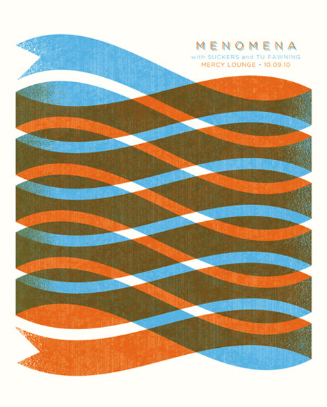
Grain Edit is also well know for their own works and compilation books with other artists. Therefore, if you have the desire to own a retro looking piece at a reasonable cost, would like to have a cool coffee table book,  you can check out their store and select what you'd like to buy. On the site Grain Edit also puts up a suggested poster for the viewers to consider, and you can even search for a design job if you'd like to also.

Well, with all that being said, I hope you can see a little of why I like this blog so well. To understand completely though, you really need to stop by and browse for yourself.


Modern Furniture

28 October 2011

Earlier Today, Did You Miss It...?

Photo property of Edwin Wade.
Earlier today, a cool post popped up on my google reader. It was from Atomic dustbin.com. If you don't know yet, this is the site of the very talented artist Edwin Wade. Anyhow, today he posted a serigraph, real in print for sale.

Like all his stuff, it's a credit to his talent, and I'm pretty sure it'll make any home look Mid-Century too. So go check it out. Sure you see it above, but on his site, he explains all the reasons that Serigraphs are good options for art lover/collectors. Alright then, have fun buying his art. Oh, yeah... almost forgot. I got an interview that I'll be posting with him soon, so keep posted.

If It's Hip, It's Here: ArchiTech's Future Perfect: Mid-Century Modern Design Drawings

Photo from www.architechgallery.com
That crazy little RSS button under the "follow my site" title is one of the best inventions ever created. Why? Because I'm a sucker and can't say no. I mean...I find one cool post, and then, for the rest of my days, I'm getting every lame post posted by every blogger that I couldn't refuse to follow. Then, there are the times that, for some unknown reason, I don't push it and it takes me for ever to find their site again.

What does this have to do with architecture you may ask. Not much, really. However, it is somewhat related. See, I find and follow (willingly or not) a lot of blogs on architecture. While architecture is something I REALLY enjoy, I find that architectural renderings are just as cool if not cooler than the real building created. So, from time to time, I go looking around for Mid-Century/Atomic Age architectural renderings. On one of these occasions, I found this site:  If It's Hip, It's Here: ArchiTech's Future Perfect: Mid-Century Modern Design Drawings. 

If It's Hip, It's Here, has a post on a really cool gallery called Architech Gallery. Here you will find a super rare illustrations of different MCM homes, buildings, furniture, and technical designs. I really found the post nice and the the online gallery as well. They are both definately worth a look at.

Be careful though, because on at least one of these sites, you'll have to choose whether you want to fight off the RSS button temptation, or sub come to its powers. Really though, that's for you to decide.

Posted using ShareThis
Some of the links in this post are affiliate links. By using these links you can get what you need/want and help Amidst Mod to continue providing info and inspirations  Modern Lamps


27 October 2011

26 October 2011

Finding The Eames Part 2

Photo linked from Palisadespost.com
Really, I hadn't planned on posting a part 2 this soon, but today I found a really nice article on the Eameses via PrairieMod. So, to help you see more about who they where, and how their house came to be, I give you this link to palisadespost.com. See "Finding The Eames Part 1" here. Modern Lamps

24 October 2011

TWA Terminal by Eero Saarinen, More Than Architecture

TWA Flight Center (JetBlue Terminal 5) - 1961
From MidCentArc via Flickr
This morning, thanks to Jason Whiton of Spy Vibe, I was reminded of how incredibly beautiful the TWA Terminal by Eero Saarinen* really is. While the terminal has been renowned for decades as a masterpiece of architecture, for Mid-Century Modern enthusiast and others alike, I gained a new perspective of it today.

I've heard and read many times that the terminal was sculpted, and of it being a true work of art. True, all architecture is art, but in comparison to the TWA terminal, most other architecture is just stacked materials. While I had always appreciated the form and flow (that jet age look) of the TWA terminal, it wasn't until my recent post on "Knoll Furniture" that I found the first key that changed how I saw the TWA terminal.

In the "Knoll Furniture"post there is an interesting video about Eero Saarinen's furniture* and design*. In this video, Brian Lutz (author of Knoll Furniture*) states that Florence Knoll told him, speaking about Eero Saarinen:"before anything else, he's [Eero Saarinen] is a sculptor". Truly, that is evident in much of his work, but I think the TWA terminal points that out better than anything else.

Saarinen's* qualities as a sculptor are abundant in the TWA terminal. In the photos on Phaidon's site, you can see many of these qualities very clearly. Some instances that are well known would be the flowing stair cases, the hanging clocks, the seating, reception desk, and the handrails. However, some thing more caught my eye when I was comparing the photos that I had seen before, with those on Phaidon's site. In all that Eero Saarinen* crafted for the terminal, he choose textures and colors that added depth to the dramatic, but smooth lines he drew in 3 dimensional space. Space and depth became divided, not so much by a line, but more by a cast shadow or a subtle change in tone depth. This added a dimension that takes normal 3 dimensional space to its limit. With his final work, he really showed his hand as an artist, as an architect, and...in the words of Florence Knoll, "before anything else, as a sculptor".