Pages

04 May 2013

Mid-Century Hobby's: Douglas Fir Plywood Home Storage Plans (semi hard to find)

Check out more about this book by clicking.*
As far as collecting goes, this is a book to have. As far as building projects go, this is a book to have. And as far as the technical drawings, designs and illustrations...? You got it. This is the book to have.

In other words... If your a book collector, mid-century enthusiast, and you like to do woodworking as a hobby, you'll really enjoy this book.

You can check out more photos of what the book has to offer by clicking here*, or on the caption below the photo.

Just a note. All ads,store apps, and links with an (*) are affiliate links. These links are the method that keeps Amidst mod going financially.


03 May 2013

Mel: An illustrated Painting


A while back I did this as a gouche painting, but I just decided to redo it with in illustrator with some texture and with a faux frame. It's just for fun.

Thrilling Vintage Sci-Fi Magazine Cover Art

Other than mid-century wood working books*, my next favorite thing to collect are the mid-century sci-fi* books. This is a mag, but you get the idea.

Check out more covers at modern_fred's flickr.

Toronto City Hall

Toronto City Hall by Chimay Bleue
Toronto City Hall, a photo by Chimay Bleue on Flickr.
Chimay Bleue is one of my favorite contemporary architecture photographers. He's been a super nice guy when we've talked, he's got a great sense of composition, and his well balanced approach to photography post process puts him in a much lacking category of non-over the top photographers.

Maybe, if all works out, I'll do another post of his photography real soon! In the meantime though, check out his flickr here, and the interview I did with him here.

Via Flickr:
Architect: Viljo Revell (1960 - 1965)
Structural engineer: Hannskarl Bandel
Location: Toronto, Ontario, Canada

Hanging out with friend and architect Stephen Mak in Toronto, Canada last week. Had a lot of fun!

Practical Sculptures Pt 2

If you look around many of the "REALLY NICE" Mid-Century homes*, you will almost surely find a very practical and functional Mid-Century/retro modern sculpture* hiding in plain sight. It may come in various forms: wrought iron, brass, copper, wood, ceramic, or plaster. They come in neutral tones, painted bright colors, or tarnished. They're very handy to have around in winter storms, on lazy evenings, when the window is open and there's a bunch of papers on your desk, or... just when you want to look at a really nice piece of art that was created many years ago. What am I referring too?

Photo Source
While the description above could refer to any number of things that you have have found in a retro modern home of the mid-century era. I'm revering to the oddly antique, but still functional, candle (stick) holder.

Having seen many candle (stick) holders* in my day, I have seen some very beautiful and quite inspiring ones. Then again, I've seen some not so inspiring ones. However, the mid-century candle (stick) holders/bases*, have almost always been a genre of incredible art to me. Being so simple (in most cases) in form helps them lend so well to the Mid-century modern style. It's true that not every candle (stick) holder* from the mid-century/retro times are awesome, but I'd say, most are.

One really good reason for looking into adding these to your entourage of art/sculptures, is that they are very handy to have around in the case of a power outage. Plus, for many, they are great accents to have when you want to have a quite dinner of romantic evening.
Photo Source

Another really good reason to have candle (stick) holders* is, they add a functional piece to your art collection that, many times, fills that thinly vertical space that I often find exist. It's amazing what that thin, tall sculpture can add to your ambient when placed in the right location.

Who though, are the manufacturers of these useful pieces of art?
Honestly, the designer names are all over the board. There are holders from the likes of Jens Quistgaard*, Tiffinay's, Murano Glass, Carl Malmsten, Witco* and you may even see a few from Herman Miller, Knoll* and other mass production designers and manufactures of the time. As far as Herman Miller and Knoll* goes, it's kinda hard to find out if they really have produced many of the candle holders. Unfortunately, Herman Miller and Knoll* are terms that are SO FREQUENTLY applied to products of other manufactures, that it's hard to be sure which candle holders are really produced by these 2 big designer/manufactures and which ones are just labeled as such to draw business.

Photo Source
In any case, there are no shortage of candle holders* out there for sale. The styling options are varied and plentiful. This is great, because you have such a wide option range. You have everything from brutalist* to danish modern* back to faux french provincial*. Good thing for us, is that almost all these styles work well with mid-century/retro modern design.


Still, no matter what your preference, you can find something that fits your style. To help a bit in your deciding, I'll leave you with this handy tool.

Please note that all links with an (*) beside them are affiliate related links. These links, as well as the products apps, such as the one at the bottom of this post (Ebay.com) are directly related to my affiliate programs and help provide the needed income to keep Amidst Mod going. Thank you!


02 May 2013

What Practical Art Are We Talking About Next?

Which piece of practical art will we talk about next? It's in this photo, and it's closer than you realize. In the meantime though, just sit back and enjoy all these cool goodies Javier Garcia Design is showing in this photo.

01 May 2013

SpyVibe: SPIES ESCAPE NETFLIX

Dr. No On Ebay*

SpyVibe: SPIES ESCAPE NETFLIX: Spy Vibers who use Netflix to stream classic movies from the MGM, Warner Brothers, and Universal catalogs have tonight only to screen titles...

I know this out of the norm for Amidst Mod, but I think you should check out what Spy Vibe has to say. 

Practical Sculptures

Via Flickr:
New art bumps the ball clock and other pieces to a different room. Painting isbby Jan Danziger, 1970. Kinetic sculpture still a mid-century mystery and bronze piece is by Elizabeth Kohler.


If you recall, yesterday we were talking about practicle objects to have in that mid-century/retro house of yours and it double as a piece of art. Yesterday, I showed you a few cool items for the kitchen, but there are ton more of those out there. Today though, let's look at the living room.

Here you see Sandiv999's flickr stream photo.  I put her photo up because her selection of object sculture selection is amazing. She has a wonderful selection of pitchers, vases, lamps, bowls, and candle holders that really could (if she chose to) be used, but at the same time, they look wonderful on this mid-century shelving system.

With this single photo, it's very easy to see the practicle application of using vintage/retro/Mid-century objects as necesary house hold items and art. Now, once we've bought them, we have to make the decision as to weither or not we really will use them as such. That's a whole different story.

However, you need to find the items* first. So, let me help you a bit. Here are some vases* that can serve as art, and be functional.

Vintage Retro Atomic Heavy Amber Vase*


German pottery small RED ceramic vase BAY 536-11 midcentury fatlava retro kitsch*

 Jopeko Red West German Pottery Modernistic Mid 20 th Century Vintage Retro Vase*


Don't forget to check out her flickr account here. Also, you can see her interview with me here. Plus, if your looking for more Vases, Check out the links and ebay app below.

Google search- Retro Vases
Etsy.com search - Retro Vases

Please note that each link that has an (*) at the end is an affiliate link. These links help provide income to Amidst Mod so that we can keep this blog going. 

Our Next Topic...

Mid Century Vase, Atomic, White with Black Band

So here's a hint as to what the next post will be about. Do you think you know? Better yet, do you have anything like this around your house? Let us know about it in the comments. Leave a link if you have photos. 

Later we'll get on this subject a bit more. For now though, just drool....

Oh yeah, don't forget to check out more such items here*

Please note that each link that has an (*) at the end is an affiliate link. These links help provide income to Amidst Mod so that we can keep this blog going.  

30 April 2013

Classic dishware that may fit your century.

CHEAP TO CHIC: ON THE EDGE WITH A CLASSIC DINNERWARE PATTERN!

If you can't find any vintage dishware that fits your style, or just can't bring yourself eat off of it, these simple patterns may be just the thing to fit your theme and not make you feel guilty at the same time. 

1950 Armstrong Mid Century Modern Kitchen

There's nothing more annoying than having a million things around the house, and realizing you need them, but they just look like clutter. An important question should therefore be, "Am I buying what I need best, or best for my need?

Let me explain. Today, unlike any other time in history, there are unlimited options (so it seems) of things that have the exact same function. Many people today, don't even think about it. They just say, I need a wine opener, carving knife, cutting board, wine glass, o something of the like. Then they go online or into a store and they buy what ever is there, what ever is cheapest, or whatever they see first. Clearly, the name game comes into play as well. That being, the brand you recognize is the best value for your dollar. Why, because you recognize it.

As many people today live in large contemporary homes. (Not contemporary as in modern. Just from our time period.) They have the luxury of an abundance of space. Cabinet and otherwise. However, my experience has been that, that is not a luxury that most mcm homes have. Sure there are a lot of large Mid-Century homes out there. Still, I would say that even the majority of those fight the never ending fight of keeping a balance between need, and where to keep it. Let's face. These great homes just where never designed for the modern plait of consumerism. Closests, kitchens, bath rooms... They all lack storage space.

It's because of these physical limitations that one needs to keep a close eye on what is purchased. Purchasing the cheapest, and easiest to find, may be more expensive in the long run. Here's a few reasons why.

- If you're not completely happy, you'll end up buying a different one.

-How much time will you spend looking for a new one?

-Expense of buying extra storage systems to hide what you bought, but didn't like.

-Frustration of dissatisfaction for product you weren't really content with in the first place.

-In extreme occasions, you spend time and cash to build an extension to your home/remodel.

I know that this may sound a little extreme, but lets face it. Many of these homes have been there for 50 or more years, and many of them where never modified by the original owner. Many of them are still don't have large add ons. Why, because people where settled for less, and when they bought, they tried there hardest to get what was best for their use and space.

Even in the post Mid-Century era, it's possible to do the same thing. It may take a bit more planning, and research. It may even cost a bit more, but it can be done. Let's look at some items that are available and can help us meet out goal.

Lets start with the kitchen.
As you can see in the photo above, if items are selected judiciously, you can have what you need and still store them in the open, and they work as decorative accents.

Vintage Mid Century Mod Georges Briard Large Cooking Pot 10" Clean Very Cool  *


VINTAGE DEEP FRYER TAYLOR CANDY JELLY COOKING BAKING THERMOMETER *


  MID CENTURY SET COOKING UTENSILS *


mid-century modern Serendipity enamel 4-pc cooking set -wok, paella pan, broiler *


Vintage Mid Century Kitchen Utinsel Foley Aluminum Juicer Orange Juice Squeezer *


1950's Windsor Toaster - Mid Century two slice automatic toaster


Mid Century Modern Flame and Frost Casserole


If  you notice, each of these items could easily be displayed in open shelving or on counters that would not only allow you take advantage of having, at least, some of the kitchen* ware you need while still having the ability to use it as a decor piece if you choose to do so.

If you're interested in seeing more vintage/retro* items that are avialable for your mid-century modern/retro kitchen check out these links. 
 Etsy Mid-Century Kitchen
Mid-Century Danish Kitchen via Google
Mid-Century Cooking - Ebay* 

Please note that each link that has an (*) at the end is an affiliate link. These links help provide income to Amidst Mod so that we can keep this blog going.  

29 April 2013

PLASTOLUX: CHALET 1 by THIERRY LEMAIRE

Photo taken from Plastolux.com
Seriously, I could see this place having been part of one the elaborate sets on an old James Bond movie. You know, one of the James Bond movies that had SPECTOR in it.

Still, if you would like find out more about this cool snow den. Check out Plastolux's article here.

Vioski: Brandon sectional


Vioski: Brandon sectional

Jenn Ski found this cool mcm sofa. You should click her name or here to find out more. 

Black, White, and Grayscale art for your Mid-Century Home


Mid-Century Interiors, a photo by Like That One on Flickr.
Mid-Century Interiors by Like That OneA great style of art to hang in your Mid-Century Modern home is Black and White, and Grey scale art. Why you may ask? Well... there are few reasons.

First,
There is no time frame in the mid-century period in which B&W or grey scale art and professional photography or armature photography (mainly early 60's and later) available for those who had money to decorate said mid-century homes. In fact, black and white photography is very applicable to non modern mid-century/vintage/retro homes. Take your pick on what you choose to call them.

Second,
Black and White or Grey scale art go with just about any type of interior design. Color wise that is. Image and and contrast weight are still aspects that need to be considered for each setting.

Third,
There is a ton of it available in a huge variety of designs.

Fourth,
Just about anyone who has a camera (of just about any type) and/or a computer can create their own B&W or grey scale art.

Fifth,
Any digital photo can be printed in Black and White if the creator chooses, or if you happen to have the original file.

For me, these are very powerful reasons.

So, here are a few selections I like, and locations to look for B&W or grey scale art for your mid-century, modern or not, home.


This is an affiliate app and links that help provide amidst mod with a small, but necessary income when you buy these products or products from these vendors.

Mid Century Modern Interior - Albano Daminato

Via Flickr:
Mid Century Modern Interior - Albano Daminato as seen at plastolux

This, while being a recreated mid-century setting, is still a very good example of art selection for the setting. Two things stand out to me about the art used in this sitting area.

First, is that the art, while being an integral part of the interior design, is not overwhelming and doesn't scream for attention. On each of the pieces, the art fits in well with it's ambiance. That's not to say a high single color contrast wouldn't have worked here either. Still, most of the time, art is best used as the garnish. Not the main mill.

Note though, that in both of the paints, the art is a very soft contrast. Not a super hard one. Gradient painting, such as the one on the left was a great choice for softly tying together the colors and textures of the room.

Noting the photo/painting on the back wall. While it, in itself is a piece that has a lot of hard contrast, this contrast is softened by the fact that the lines are thin. Having so many thin lines helps one perceive the image a gradient, when applied on a high contrast background.

Second,
Each piece in the setting is well places to add to the overall pulling together of the room. By selecting different pieces, the designer could have easily separated the room at the bar/counter where the statue sits. While not to say that would have been a bad thing, by drawing the whole space together, it opens up the space and makes the over all feel much softer.

Looking at the sculpture, you may notice that it is very weighty. It looks heavy and somewhat blockish. I find this helps give weight to the room. Many times, the color of the wood used, and the form of the furniture can make the wood seem light in visual weight. Also, with the rest of the room, from what we see here, is very light in color texture, and visual weight. So, the solidity of the sculpture ties in well to grounding the ambient feel.

While the table, chairs and pendant lamps are different materials, they are very close in color combination, and add a welcome touch of color that helps keep the eye interested and give the setting a warmer and cozy feeling.

One last thing I would like to mention that I had forgotten to mention in the 2 part article "Art For The Mid-Century Home", is the creative use of matting and framing. Framing the art on the back wall differently could have changed the whole feel of this room as well. By using the circular image with the large white matting/boarder on the image, it softened the image and it's weight in the room greatly. Also, the physical sizing of the framing also changes the way the art is perceived in the room. If the art had just carried a frame just around the circle of the image, I find the image would not have balance the room as well as it does visually.

Remember though, I'm not saying these are the only pieces that could have been use. However, they are really good choices for this interior.

28 April 2013

Art For The Mid-Century Home -Pt 2 Seeing art for what it truly is.

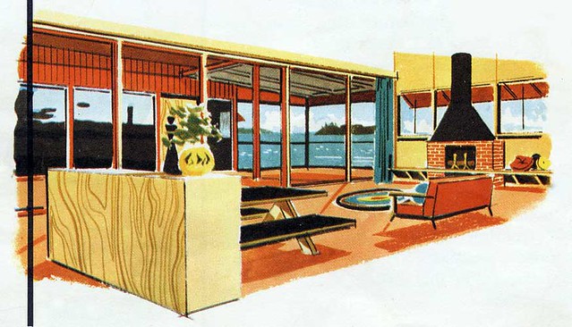
Maybe I should say, seeing art for how it could potentially fit. A great, and sometimes daunting thing about living in the post mid-century era is that we have huge selections of vintage and contemporary mid-century art to choice from. I guess you could call many artists today Mid-century modern revivalist artists. So, that too, means there are a lot of pieces to choose from. One thing to keep in mind though is that mid-century modern design covered a few decades. That means that it's important to keep the aesthetic of what your putting together in perspective.

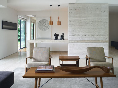
A good example would be if someone had worked hard using materials and colors of the late 50's modern in there home and then picked a bunch of plastic and epoxy mod art from the late 60's and early 70's. Likely, the look would not be fluid. More appropriate would be abstracts of like colors, maybe more pastelish,  and on canvas or board. Simple drawings or light colored minimalist landscapes could work, as well as black and white photos, or figure drawings. Using textured art would also be very appropriate. Framed panels of linen with sculpted wood or screen printed image applied. Even then you would want to be judicious about the color and shapes chosen.


Many times an important factor that is over looked is the texture of the art that someone is looking at buying. Many people simply don't realize it, but texture is extremely important when trying to tie art into any vintage/retro styled them. This even includes investigating the papers and textiles produced under modern circumstances. Since processing such materials is even more mechanically refined than in the past, many of these products do not have the same textures of vintage products. This can cause a since of almost having it right, but not quite, and not being able to put your finger on why.

To illustrate, if you are looking at purchasing a reproduction of a beautiful oil abstract, but you buy it printed on a modern high gloss paper, you may very well be disappointed in the piece once it's hung in your selected space. While it is true that a good frame can make a huge difference. A good frame can not change the lack of authenticity the art may have if printed on a poorly chosen stock (paper).

What could be done to make the print of a fine abstract painting fit in with the ambiance of your home or space? Select a textured paper that will give the painting a texture, even if only slightly, or print it on canvas. One slightly textured paper would be a cotton rage. Another option is to think about using a heavy, medium, or light textured water color paper to have the image printed on. Quality giclee printing facilities have varied selections of papers to choose from.

Possibly not this photo
Finish on the art is also very important to consider. While, I find that high gloss photo papers have become extremely cheap to print on at many big stores in large format, they most likely will not give the appearance you would want for your mcm interior. A semi gloss or matte paper or canvas is more than likely going to suit your needs best.

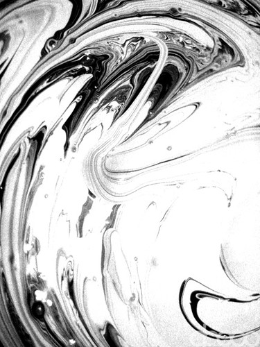
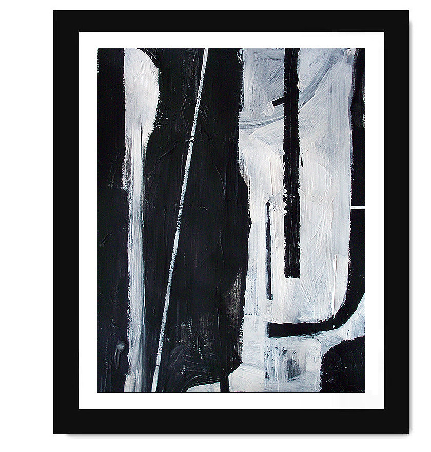
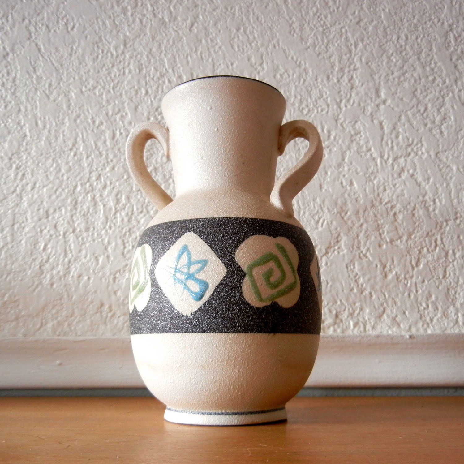
Possibly on Watercolor paper.
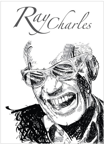
Finally, don't be afraid to use art that may not typically be thought of as mid-century decor. I'm definately not encouraging anyone to stray from the feel of Mid-Century, but many artist today copy the painting styles and techniques of the artist of fame from the Space Age. A strong impressionist painting (contemporary or vintage) may suit your needs fine.

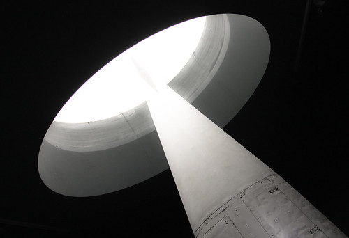
Possibly this one though.
Almost everyone today has a DSLR camera or point and shoot. Why not take some black and white photos of old factory's. Do you like animals, clouds, old houses, barns, fields or flowers? Why not take photos of those and have them printed. If you doubt how they will turn out, you can find a number of tutorials on youtube that can help you turn color photos into vintaged, or accentuated black and white photos. Just remember that for most design dated from 60 or earlier, you would not find many color photos. Also, as a graphic designer and photographer, I warn you that re-creating the old color photo style photos is an advanced process that is long and arduous.


I find that there is almost always art from some poor tortured artist in the local area that you could find at a reasonable price. Do you like their art? Frame it and hang it. Typography is also a beautiful option for hanging art. There are so many options to choose from.

Now a days, we count with the wonderful world of the internet as well. By just going thru flickr, you can find a huge number of photos and images of vintage/mid-century/retro origin or inspiration that you can easily have printed.

Only print images with the permission of the owner. Even if they don't have the images locked or prohibited from downloading. Show the respect they deserve as a creator.  Many times the artist of the image will even give you the image if it's for your personal use. However, you should always check with the artist or host first. Also, if you're going to get an image for free out the kindness of their heart, why not offer a slight donation. It's really the leash you can do for them. I mean, seeing as though you are going to save all that money on not having to buy an expensive image, why not help the poor unknown artist out. I'm not even saying offer a lot, just something. If you can that is. You'll be suprised at what kindly asking can do for you. Still, don't assume anything.

One last place to remember is Ebay*. There is always a ton of mcm influenced, or original art there. Many times you can even find a decent price for some it.

Since I have gone over the theories of how to pick out art, my next few post will be dedicated to the practical application of art choices.  Let me know if these article are of any help.

See the fist part 1 of this series here.

 links with an * at the end are affiliate links that provide amidst mod with a small, but necessary income when you buy products or products from these sites.