
Many times an important factor that is over looked is the texture of the art that someone is looking at buying. Many people simply don't realize it, but texture is extremely important when trying to tie art into any vintage/retro styled them. This even includes investigating the papers and textiles produced under modern circumstances. Since processing such materials is even more mechanically refined than in the past, many of these products do not have the same textures of vintage products. This can cause a since of almost having it right, but not quite, and not being able to put your finger on why.
To illustrate, if you are looking at purchasing a reproduction of a beautiful oil abstract, but you buy it printed on a modern high gloss paper, you may very well be disappointed in the piece once it's hung in your selected space. While it is true that a good frame can make a huge difference. A good frame can not change the lack of authenticity the art may have if printed on a poorly chosen stock (paper).
What could be done to make the print of a fine abstract painting fit in with the ambiance of your home or space? Select a textured paper that will give the painting a texture, even if only slightly, or print it on canvas. One slightly textured paper would be a cotton rage. Another option is to think about using a heavy, medium, or light textured water color paper to have the image printed on. Quality giclee printing facilities have varied selections of papers to choose from.
 |
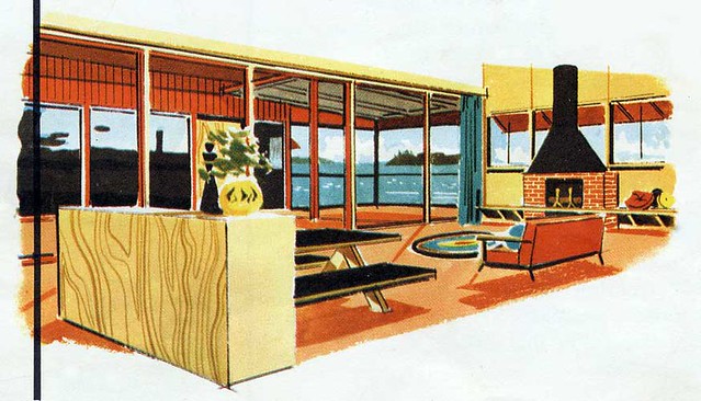
| Possibly not this photo |
 |
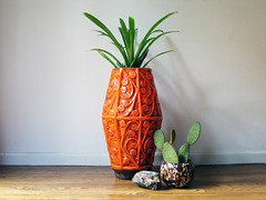
| Possibly on Watercolor paper. |
 |
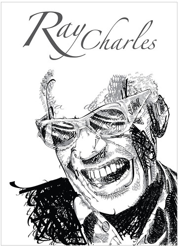
| Possibly this one though. |
I find that there is almost always art from some poor tortured artist in the local area that you could find at a reasonable price. Do you like their art? Frame it and hang it. Typography is also a beautiful option for hanging art. There are so many options to choose from.
 Now a days, we count with the wonderful world of the internet as well. By just going thru flickr, you can find a huge number of photos and images of vintage/mid-century/retro origin or inspiration that you can easily have printed.
Only print images with the permission of the owner. Even if they don't have the images locked or prohibited from downloading. Show the respect they deserve as a creator. Many times the artist of the image will even give you the image if it's for your personal use. However, you should always check with the artist or host first. Also, if you're going to get an image for free out the kindness of their heart, why not offer a slight donation. It's really the leash you can do for them. I mean, seeing as though you are going to save all that money on not having to buy an expensive image, why not help the poor unknown artist out. I'm not even saying offer a lot, just something. If you can that is. You'll be suprised at what kindly asking can do for you. Still, don't assume anything.
One last place to remember is Ebay*. There is always a ton of mcm influenced, or original art there. Many times you can even find a decent price for some it.
Since I have gone over the theories of how to pick out art, my next few post will be dedicated to the practical application of art choices. Let me know if these article are of any help.
No comments:
Post a Comment