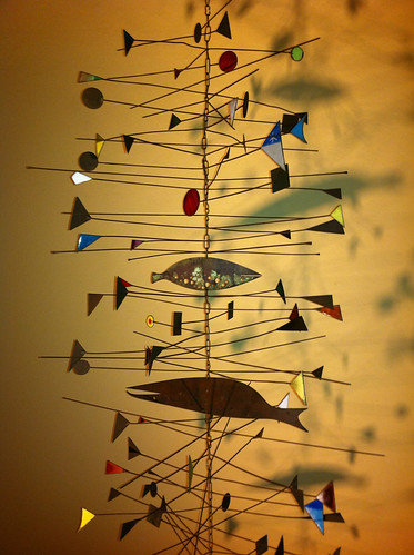
Well, if you don't understand, or you just want to reminisce, here's a cool video to do it with.
21 October 2011
Do To My Busy Schedule
As mentioned in the title, I'm busy today. However, I still have time to share a video, albeit old, that talks about the importance of the Googie style. You know, that California Coffee Shop style that we all find so cool. Those angled roofs jetting off into outer space...Signs that create a motion while sitting still, and using the whole building as a huge, awesomely designed sign for your modern business.
Well, if you don't understand, or you just want to reminisce, here's a cool video to do it with.


Well, if you don't understand, or you just want to reminisce, here's a cool video to do it with.
20 October 2011
Barney Reid Mobile
While this isn't Chimay Bleue's month to be featured anymore, I just had to post this very cool art.
Finding The Eames Part 1

As far as Mid-Century Designers go, the Eames' are definitely a pair that come up quickly in a conversation. However, while I appreciate them a lot, I just never have been fanatical about them. Granted, they have cool works, and the lounge chair is probably one of, if not the most, recognizable icon of MCM furniture. Still, though, I never knew enough about them to get a full scope of who they were.
Recently though, that has been changing. Why, you may ask? Well... there are few different reasons.
While their works (at least the most popular ones) are seen on almost every mid-century site and blog, it seemed that the same handful of designs always showed up. Along with that, it seemed (to me) that very little was every really explained about them in a way that expressed their quirks and personality.
To that end, it's only been recently, that I've come to appreciate them a bit more, Not as just the people who designed this or that, but the people who looked for "the way it should be-ness" in their designs. People who where artist. Ones that where so interested in design and it's effect on life, that they studied nature to better the relation between humans an objects. Those are the things that I find interesting.
So, how did this change for me? First, was an article that I found on google books. This article comes from Life Mag Spep.11, 1950. While the article is short, I get a little bit more of a feeling about Charles Eames, and the importance of friends and design in his life. Plus, the way I read it, it seems that the article writer is completely unenthusiastic about this assignment, and understands the Eame's artistic qualities even less. For some reason, I appreciate that difference.
Another piece that helped me see a bit more about the importance of design is the video that I recently found online about the aluminum chair group. It talks about how the chairs came about, and how detailed the Eames' where in designing a producing these chairs.
All of this has helped me to appreciate the Eames' a good bit more. While I've never met them, I feel that people should be appreciated for themselves, more than just the designs that they created. That's what has been happening to me.
I hope you take the time to watch the video, and read the Life article. It's possible, that you may appreciate the furniture you have for more than it's esthetic quality.
See Finding The Eames Part 2 here.
Some of the links in this post are affiliate links. By using these links you can get what you need/want and help Amidst Mod to continue providing info and inspirations
19 October 2011
Norman Cherner Book. How Much Would You Pay?
 | |
| Photo from www.modernism101.com |
 | |
| Photo from www.chernerchair.com |
Having found out about the books, I had to check them out. Mr. Cherner indeed wrote books. Some very interesting and cool ones in fact. From what I can tell, he wrote 4 books. According to Chernerchair.com, which his sons run, he wrote: "Fabricating Houses from Component Parts" (1958) "How to Build a House for Less the $6,000" (1960), "Make your own Modern Furniture" (1953) and "How to Build Children's Toys and Furniture" (1954).
All of these books are very interesting to me, but of particular interest to me is the "How to Build a House for Less the $6,000". Now, don't get me wrong, I know that today your not going to get the materials for less than $6000, but I have to imagine that there are some very cool ideas in this book. Only, there is one small problem... The price tag for the book. From what I can tell online, the book sales for anywhere between $200 and $300 dollars. To collectors that may not seem unreasonable, but it's just out of my price range for the moment. Respecting the rarity and design quality of the book, I can see why it would fetch such a price. For me though, I'd rather buy more furniture wood.
Also, for more info on the Cherner Chair, Norman Cherner, and furniture that has been created by Benjamin Cherner, go to www.chernerchair.com
If your interested in buying any of Norman Cherner's books, below you will find links to what I've found offered online. These are all the links that I have found.
Links to purchase his books
Fabricating Houses From Component Parts (Hardcover)
Make your own modern furniture;: Working plans and room designs for more comfortable and convenient living [Hardcover]
1957 Norman Cherner PRE-FABRICATING HOUSES 1st edition
Some of the links in this post are affiliate links. By using these links you can get what you need/want and help Amidst Mod to continue providing info and inspirations
18 October 2011
Mid-Centyury Room Divider DIY Plans
A few years ago I found Populuxe Books. I constantly stop by to dream about books that I want, and to get inspired by the furniture featured in the DIY Books they offer. Today, however, I found something new, but very cool.
On the Populuxe Books site, there is a page called example library. On this page, you will find a ton of articles about, well...mid-century stuff. It goes over a real gambet of things. There are a number of house plans, furniture plans, and articles on interesting MCM things. These articles are taken from various books that they have for sale. I'm sure the idea is to wet your whistle. So, I'm going to share these with you.
Today, I'm featuring the room divider, because I have had a number of people ask me if I have plans for these, or to build one of these so they can see how to do it. This plan here is a built in unit. So, don't get confused. Here the idea is to make it permanent. Therefore, this may, or may not be what you want. Anyway, here's an image and the link to their page.


Today, I'm featuring the room divider, because I have had a number of people ask me if I have plans for these, or to build one of these so they can see how to do it. This plan here is a built in unit. So, don't get confused. Here the idea is to make it permanent. Therefore, this may, or may not be what you want. Anyway, here's an image and the link to their page.
Some of the links in this post are affiliate links. By using these links you can get what you need/want and help Amidst Mod to continue providing info and inspirations
17 October 2011
Knoll Furniture
 |
| Photo property of 2modern.com |
 |
| Photo source: http://www.aisleone.net/2010/design/mid-century-knoll-ads/ |
This video helped realized that Knoll*
Frequently people talk online about furniture and designs by famous designers and the influence their design had on the world. Yet, a lot of times, very little mention is made of the companies that made these designers concepts become reality. While the designing is a pain staking process that demands respect for completion, equal respect is due to the companies that back and promote the products so that they sell.
So, here's the video, enjoy.
16 October 2011
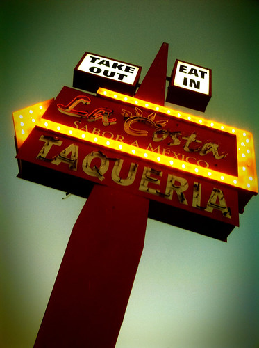
La Costa Taqueria Neon Sign with Lomo app for iPhone
Here's a cool new photo from Sue on her Sueism1 Flickr stream. I really find her iphone photos interesting. She also has a habit of finding very cool subjects.
This sign is a good example of her ability. While this sign, in comparison to some Mid-Century signs, would be plain, it really is a good design.
A few of the aspects that draw my attention are the very simple shapes, and the lack of clutter. Don't get me wrong, I love the Googie motel signs too, but sometimes, less is more, right?.
I find this sign has balanced look to it, and while the rectangle portion of the sign is fairly plain, the arrow makes up for it. Also, with the floating boxes at the top, the sign his given a lighter, floating feeling.
Above all that though...While this sign could have bee shot in a way that made it look simple and fairly plain, Sue gave the sign a feeling of grandeur and flight, which is probably what the designer had in mind, when it was originally designed. That's just my take on it though.
Subscribe to:
Posts (Atom)