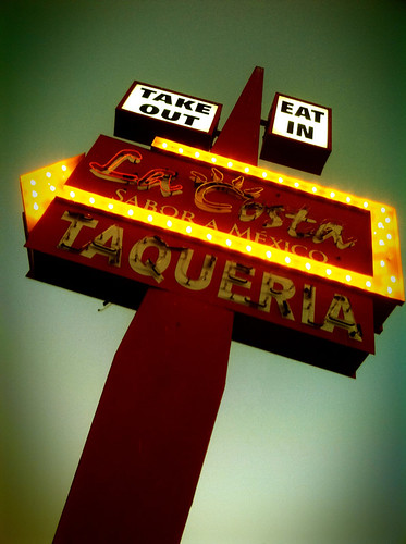
This sign is a good example of her ability. While this sign, in comparison to some Mid-Century signs, would be plain, it really is a good design.
A few of the aspects that draw my attention are the very simple shapes, and the lack of clutter. Don't get me wrong, I love the Googie motel signs too, but sometimes, less is more, right?.
I find this sign has balanced look to it, and while the rectangle portion of the sign is fairly plain, the arrow makes up for it. Also, with the floating boxes at the top, the sign his given a lighter, floating feeling.
Above all that though...While this sign could have bee shot in a way that made it look simple and fairly plain, Sue gave the sign a feeling of grandeur and flight, which is probably what the designer had in mind, when it was originally designed. That's just my take on it though.
1 comment:
I can't believe how much of this I just wasn't aware of. Thank you for bringing more information to this topic for me. I'm truly grateful and really impressed.
Post a Comment