Via Flickr:
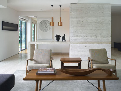
Mid Century Modern Interior - Albano Daminato as seen at plastolux
This, while being a recreated mid-century setting, is still a very good example of art selection for the setting. Two things stand out to me about the art used in this sitting area.
First, is that the art, while being an integral part of the interior design, is not overwhelming and doesn't scream for attention. On each of the pieces, the art fits in well with it's ambiance. That's not to say a high single color contrast wouldn't have worked here either. Still, most of the time, art is best used as the garnish. Not the main mill.
Note though, that in both of the paints, the art is a very soft contrast. Not a super hard one. Gradient painting, such as the one on the left was a great choice for softly tying together the colors and textures of the room.
Noting the photo/painting on the back wall. While it, in itself is a piece that has a lot of hard contrast, this contrast is softened by the fact that the lines are thin. Having so many thin lines helps one perceive the image a gradient, when applied on a high contrast background.
Second,
Each piece in the setting is well places to add to the overall pulling together of the room. By selecting different pieces, the designer could have easily separated the room at the bar/counter where the statue sits. While not to say that would have been a bad thing, by drawing the whole space together, it opens up the space and makes the over all feel much softer.
Looking at the sculpture, you may notice that it is very weighty. It looks heavy and somewhat blockish. I find this helps give weight to the room. Many times, the color of the wood used, and the form of the furniture can make the wood seem light in visual weight. Also, with the rest of the room, from what we see here, is very light in color texture, and visual weight. So, the solidity of the sculpture ties in well to grounding the ambient feel.
While the table, chairs and pendant lamps are different materials, they are very close in color combination, and add a welcome touch of color that helps keep the eye interested and give the setting a warmer and cozy feeling.
One last thing I would like to mention that I had forgotten to mention in the 2 part article "Art For The Mid-Century Home", is the creative use of matting and framing. Framing the art on the back wall differently could have changed the whole feel of this room as well. By using the circular image with the large white matting/boarder on the image, it softened the image and it's weight in the room greatly. Also, the physical sizing of the framing also changes the way the art is perceived in the room. If the art had just carried a frame just around the circle of the image, I find the image would not have balance the room as well as it does visually.
Remember though, I'm not saying these are the only pieces that could have been use. However, they are really good choices for this interior.

No comments:
Post a Comment