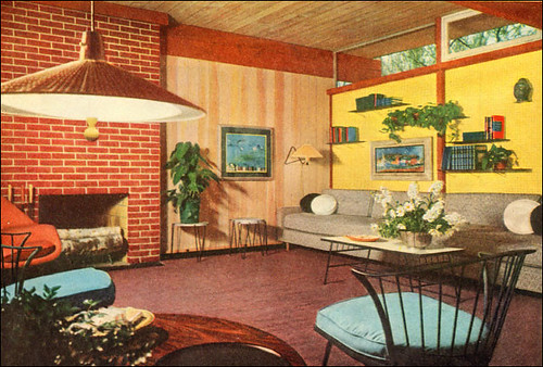
Source: Better Homes & Gardens
Image from the Mid Century Home Style collection.
As follows with Part 1 of my blog post "Art For The Mid-Century Home -Pt 1: Starting With The Basics." You can see here that the art was selected carefully so as to be that subtle touch that you notice after a few minutes, but without the room would seem lacking. Also, notice that the art in the room does not take up most of the wall space. Instead, smartly placed shelving and sconces provide artistic elements while providing the room with a 3d texture feeling. Texture is not to be under rated when dealing with a vintage retro or mid-century, modern or not, interior.
 These links are affiliate links that provide amidst mod with a small, but necessary income when you buy these products or products from these vendors.

No comments:
Post a Comment